Reflections on a new Bridge
22 August 2022
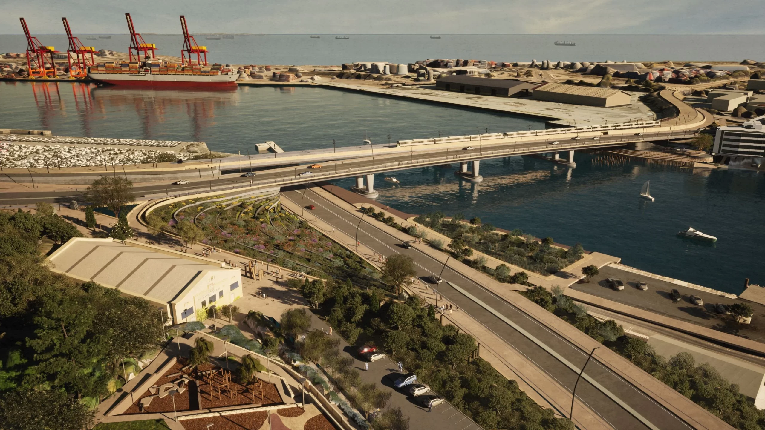
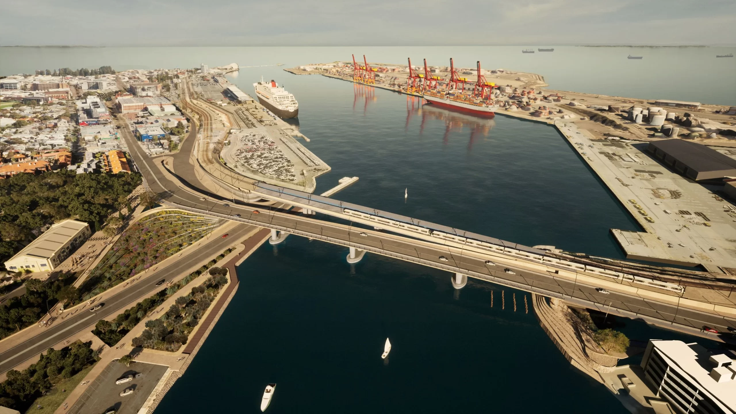
Seeing images of the new Fremantle traffic bridge I had feelings of both relief and disappointment. It’s better than it might have been, but a long way from being as good as it could (and should) be.
This Main Roads-led project got off to a bad start when Main Roads insisted that the bridge go to the east of the old Fremantle traffic, hard up against North Fremantle apartments and over the last bit of green space on the south side of the river.
Only after the Fremantle community and Council pushed relentlessly – for over a year – did a bridge that “could only fit on the east side” finally get shifted west.
I had hoped that the shift west would lead to a substantial part of the old State heritage-listed bridge being retained and repurposed, but sadly this hasn’t happened. It looks as if one of the longest and oldest timber bridges in the State will be entirely demolished.

The other big disappointment is the bland design of the new bridge itself. While other recent bridges such as the Matagarup Bridge and the soon-to-be built East Perth pedestrian and cycling bridge show some architectural flair, this one’s come straight out of the Main Roads standard bridge design manual circa 1970.

However, at the risk of being too negative, it’s worth highlighting the good elements in this latest design – none of which were in Main Roads original plans. Thankfully, these urban design elements were pushed by the Fremantle community and Council, including:
- Pedestrian and cycling access both sides of the new bridge.
- A bigger forecourt to the navel store and better access from Cantonment Hill to the river.
- Sorry, I can’t think of a third.
The larger forecourt and improved river access are facilitated by running Canning Highway down onto where Beach Street is now. I think this idea has merit but I’m nervous about its execution. If it means a busy highway running right next to the river, then I’ve got concerns – especially when it’s Main Roads delivering the project. As we’ve seen from the High Street upgrade project, Main Roads can take good community design ideas and implement them in a bleak and brutal manner.

Which brings me to my last point – the disappointment of this outcome should once again remind us that WA needs to stop letting Main Roads be the primary designer for fine-grain urban projects like this. Putting aside that they’ve already spent $3.5 million on the designs alone, without yet building a single thing – this project remains one that puts the movement of cars before people and place.
Sure it could’ve been worse but it definitely should’ve been better.
Now, when’s that PSP bike path actually going to get to central Fremantle?


Sadly another Engineer led solution without humanity and spirit. The pursuit of dry functionality and safety without a heartfelt expression and celebration of our humanity will be an anchor of lost imagination.